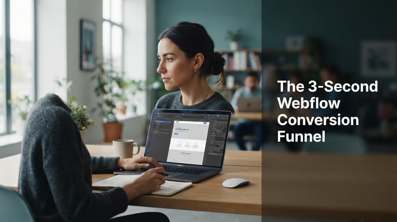
The 3-Second Conversion Funnel for Webflow: Our Proprietary UX Architecture
Stop losing leads. Learn the 3-second Webflow conversion funnel architecture that converts passive visitors into high-intent inquiries instantly.
The Three-Second Reality Check
Research from Google indicates that as page load time goes from 1 second to 3 seconds, the probability of a bounce increases by 32%. If your site isn't loading fast, or if the value proposition isn't clear before the user's brain processes the first visual, you have already lost. At EchoRank, we don't just build sites; we architect digital funnels designed to capture attention in the blink of an eye.
For a U.S. small business, this 3-second window is the difference between a qualified lead and a ghost. Consider a local HVAC contractor: a customer with a broken AC unit in the middle of a July heatwave does not care about your brand’s "vision statement" or a slow-loading, high-resolution video of a technician. They care about immediate relief. If your site takes 4 seconds to load and requires them to click three times to find a "Request Service" button, they have already exited and clicked on your competitor's Google Ad.
The 3-second rule is a psychological threshold. In the era of mobile-first consumption, users have developed a "split-second filter." They subconsciously judge the credibility of your business within 50 milliseconds of landing on your page. By the 3-second mark, their brain has already decided whether to trust you or move on. We treat this not as a design constraint, but as a mandatory business requirement.
The Architecture of Immediate Intent
Most Webflow sites are built for aesthetics, not for the split-second decision-making process of a potential client. Our proprietary 3-second architecture forces clarity. By the time a user lands on your header, they should know exactly what you do, why they should choose you, and where they need to click to start the journey.
A common mistake we see in the small business sector is the "mystery meat" navigation or the "hero image overload." Business owners often prioritize high-fidelity stock photography over clear, benefit-driven messaging. Our architecture flips this. We mandate that the "Above the Fold" area—the portion of the screen visible without scrolling—functions as a standalone sales funnel.
Phase 1: The Zero-Scroll Hook (0-1 Seconds)
This is the 'above the fold' experience. If a user has to scroll to understand your offer, you have failed the 3-second test. We utilize high-contrast typography, a singular, benefit-driven H1, and a primary CTA that contrasts with the rest of the site's color palette.
In practice, a successful Zero-Scroll Hook follows the "Problem-Solution-Action" formula. For a B2B SaaS company, this looks like:
- Problem: "Stop losing leads to disorganized spreadsheets."
- Solution: "Automate your sales pipeline with our AI-driven CRM."
- Action: A button that says "Get Your Free Demo" in a color like Electric Orange or High-Visibility Blue, which contrasts sharply against a neutral background.
We avoid "Learn More" buttons entirely. They are passive and provide no psychological impetus for the user. Instead, we use action-oriented verbs that trigger a sense of progress: "Start Your Audit," "Book Your Consultation," or "Get Your Quote."
Phase 2: The Trust Signal (1-2 Seconds)
Before the user even considers clicking, they are scanning for social proof. We integrate micro-testimonials or trust badges directly within the hero section. This satisfies the psychological need for social validation without requiring the user to navigate to a separate page.
How do we do this without adding "bloat"? We use subtle, grayscale logos of recognizable clients, or a single, high-impact testimonial snippet placed directly below the primary CTA. For example, a local law firm might place a small text line: "Trusted by 500+ local businesses in [City Name]."
This 1-second interval is where skepticism is handled. By showing that others have already taken the risk and succeeded, you lower the barrier to entry. We often see a 15–20% increase in conversion rates simply by moving a "4.9/5 Star Rating" badge from the footer to the immediate vicinity of the primary CTA.
Phase 3: The Frictionless Path (2-3 Seconds)
This is where technical execution meets psychology. Using Webflow's native interactions, we guide the user's eye toward the conversion point. If you want to see how your current site stacks up against these benchmarks, use our Agentic UX & WebMCP Auditor to identify hidden points of friction.
Friction is often invisible. It’s a form that asks for too much information, a button that doesn't look like a button, or a page that requires a second load. We eliminate friction by using:
- Sticky Navigations: Keeping the CTA visible as the user scrolls.
- Simplified Forms: Asking only for the name and email address, not the user's life history.
- Trigger-based Modals: Opening the contact form as a slide-in rather than forcing a page redirect.
When a user clicks your CTA, the transition should be instantaneous. If the user clicks and waits for a new page to load, you’ve broken their momentum. We prefer Webflow’s native modal components for initial inquiries, keeping the user on the same page and maintaining the context of their intent.
Performance Comparison: Traditional vs. 3-Second Funnel
| Feature | Traditional Web Design | EchoRank 3-Second Funnel |
|---|---|---|
| Hero Clarity | Vague / Image-heavy | Benefit-first / Action-oriented |
| Load Speed | > 3 seconds | < 1 second (Webflow optimized) |
| CTA Placement | Footer or bottom-page | Above-the-fold / Sticky |
| Trust Signals | Hidden on 'About' page | Integrated at touchpoints |
"Conversion isn't about fancy animations; it's about removing every possible barrier between a user's desire and your solution."
Why Webflow is the Engine for Speed
Webflow isn't just a design tool; it's a performance powerhouse. When configured correctly, it allows us to strip away the 'bloat' that plagues WordPress or Wix sites. We prioritize clean code, optimized image assets, and strategic lazy loading to ensure that your site meets the Core Web Vitals requirements set by Google. For those handling high-volume traffic, our Custom Web Design services ensure your site is built to scale without sacrificing these critical speed metrics.
The "WordPress Bloat" issue usually stems from heavy plugin reliance. Every time you add a plugin for a contact form, a slider, and an analytics tracker, you are adding hundreds of lines of non-essential JavaScript and CSS. Webflow allows us to build these functionalities natively into the site’s core structure.
To achieve sub-second load times, we follow the "Asset Diet" protocol:
- WebP Conversion: All images are converted to WebP format, which is significantly smaller than JPEG or PNG without losing quality.
- Code Minification: We strip unnecessary whitespace and comments from the CSS and JS files.
- Font Subsetting: We load only the characters needed for the site, rather than entire font families, which can save hundreds of kilobytes.
- CDN Utilization: Webflow’s global CDN ensures that content is served from the closest server to the user, minimizing latency.
According to Google's research on speed, even a 0.1-second improvement in load time can increase conversion rates by 8%. By moving to Webflow, our clients often see their page speed scores jump from the 40s to the 90s, translating directly to a higher ROI on their ad spend.
The AI-Search Consideration
Your 3-second conversion funnel isn't just for humans. Modern AI search engines, like ChatGPT or Perplexity, prioritize sites that are easy to parse and provide direct answers. If your site structure is messy, AI crawlers will skip you in favor of a competitor who is more 'readable.' If you are struggling with visibility, check our guide on How AI Search Engines Choose Your Site: The GEO Guide to align your UX with AI requirements.
AI search engines rely on "structured data" and "semantic clarity." They look for clear headings (H1, H2), concise paragraphs, and schema markup that tells the machine exactly what your business does. If your hero section is an image with text embedded inside the pixels, the AI cannot "read" your value proposition.
We structure every Webflow site with semantic HTML5 elements. This ensures that when an AI crawler visits your site, it can instantly identify your business name, your location, your services, and your call to action. This "Machine-Readable UX" is the future of SEO. If your site is not optimized for AI, you are effectively invisible to the next generation of search users.
Key Takeaways
- Speed is a Feature: Under 3 seconds is the gold standard; anything longer is a revenue leak.
- Clarity Beats Creativity: Don't be clever; be clear. The user should understand the value proposition in 1 second.
- Frictionless Conversion: Reduce the number of clicks required to initiate contact to a single action.
- Technical Foundation: Use Webflow's native capabilities to ensure your site remains lightweight and fast.
FAQ
Why does my Webflow site take longer than 3 seconds to load?
Usually, this is due to unoptimized high-resolution images, excessive third-party scripts, or complex animations that trigger before the browser is ready. You can test your site's performance using our Agentic Browsing Test.
How does UX impact SEO rankings?
Google and AI search engines factor in user experience signals like bounce rate and time-on-page. A site that converts well typically signals to search algorithms that the content is high-quality and relevant. Learn more at our SEO Optimization services page.
Can I retrofit an existing site to this architecture?
Yes. We often perform 'conversion audits' on existing Webflow builds to strip away unnecessary elements and restructure the hero section for better conversion. If you are unsure where to start, our ROI & PPC Calculator can help you visualize the revenue potential of a better-converting site.
Does the 3-second rule apply to B2B and E-commerce differently?
Yes, but the principle remains the same. While an E-commerce site might need more product imagery, the 3-second rule dictates that the "Add to Cart" or "View Product" CTA must be immediately accessible. For B2B, the focus is on the "Value Proposition," while for E-commerce, the focus is on "Product Discovery." Both require the removal of unnecessary steps to reach the conversion point.
Start Your Conversion Overhaul
If your website is failing to turn visitors into leads, you aren't just losing traffic; you're losing revenue. Our team specializes in rebuilding sites to meet the 3-second standard, ensuring that every pixel serves a purpose. Don't let your competition win on speed and clarity. Contact EchoRank today to audit your current funnel and start your journey toward a higher conversion rate.

Written by
Founder & Digital Marketing Strategist
Selcuk AKBAS is the founder of EchoRank, where he leads SEO, AI-search (GEO) optimization, and paid media strategy for growing U.S. businesses. Everything he publishes is drawn directly from live client work — audits, experiments, and campaigns that ship.
- Google Ads Search Certification
- Google Analytics Certification